Wedding colors photograph well when they flatter skin tones in reflected light. That's the whole principle. The camera doesn't see your palette the way the swatch board does; it sees reflectance, the light bouncing off every dress, suit, and tablecloth, and a meaningful share of that bounced light lands on faces. Palettes that photograph beautifully are the ones that send clean, flattering light back onto skin: muted mid-tones, soft naturals, colors with a little grey in them. Palettes that fight the camera are the ones that throw a color cast onto the people wearing them. Almost everything written about wedding colors is written from the mood board's side. This is the chapter from the camera's side: how color actually behaves through a lens, what Utah light does to it, and the palettes we quietly love.
Wedding colors that photograph beautifully (and the ones that fight the camera).
A working photographer's chapter on color: the skin-tone rule, what Utah light does to a palette season by season, the combinations we reach for, and the ones that fight the camera.
What's in this guide.
Why do some palettes glow on camera while others fight it?
The skin-tone rule: your palette bounces onto faces
What does Utah light do to color, season by season?
The palettes we reach for through the lens
The ones that fight the camera (and what we do if you love them)
What dates a gallery: the ten-year test
Why do some palettes glow on camera while others fight it?
Start with how you chose the colors. You probably stood in a boutique or scrolled a screen, looking at the color itself: a swatch, lit evenly, judged in isolation. The camera never sees that. On a wedding day, every color is a surface in light. It receives the light of the hour, reflects its own hue onto everything near it, and gets recorded next to the one subject that can't be negotiated: human skin. A palette that looks sophisticated as a flat lay can behave very differently as six dresses standing in full June sun.
Two properties decide most of it. The first is saturation. Direct sun amplifies saturated color the way a stage light amplifies a voice; a rich swatch indoors becomes a loud one outdoors, and loud colors don't just sit in the frame, they reflect onto skin, fabric, and the white of a dress. The second is value, how light or dark the color is. Very dark palettes swallow detail in dim light; very bright ones bounce strongly at close range. The palettes that photograph most reliably live in the middle: mid-value, gently desaturated, with enough grey or earth in them to stay calm under any light.
Our own editing approach raises the stakes here, and we'd rather be plain about it. We expose bright and open, with soft, natural contrast, which means colors render true instead of being crushed into shadow or muted by a heavy filter. An edit that lies about color can partially hide a difficult palette. An edit that tells the truth cannot. So the palette you choose is, to an honest degree, the palette you'll live with on the wall.
The camera cares about reflectance, not the swatch.
The skin-tone rule: your palette bounces onto faces
Here is the single most useful thing we can tell you about wedding color, and it's the thing the mood board can't show: the people wearing your palette stand close to each other all day. Bridesmaids lean in during getting ready, hold the bouquet next to their faces, hug, huddle for portraits. At arm's length, a dress is not just a dress; it's a reflector. A saturated emerald gown throws green up onto the jaw and neck of the person wearing it and the person beside her. A hot fuchsia does the same in pink. The camera records that cast faithfully, because it is faithfully there.
In the edit, skin is the anchor. Every other tone in the frame gets reconciled to it, because a viewer will forgive a slightly odd tablecloth and will never forgive a grey-green face. When a palette throws a strong cast onto skin, we can correct the faces, but the correction pulls on everything nearby, and there's a limit to how far it goes before the dress that caused the cast starts looking like a different dress. Muted colors barely cast at all. That's the quiet physics underneath the whole trend toward dusty and muted palettes: it isn't just taste, it's reflectance.
So the working rule: at close range, saturated brights paint the people wearing them, and muted mid-tones don't. The safest palettes sit a step desaturated from the color you first fell for. If you love emerald, look at eucalyptus and deep sage. If you love royal blue, look at slate and dusty blue. If you love magenta, look at mauve. The photograph keeps everything you loved about the color and loses the part that fights the faces.
Skin is the anchor. Every other tone gets reconciled to it.
What does Utah light do to color, season by season?
Utah light is high, dry, and clear, and it doesn't treat a palette gently. In summer, alpine sun at midday is some of the hardest light in the country: saturated colors go electric, whites go hot, and lawn-and-bench greens go nearly neon in full sun. A palette that reads soft on the screen can read loud on a July afternoon. Summer rewards restraint: naturals, ivories, butters, and gently greyed tones hold together at noon, and everything calms down again in the long golden evening.
Fall flips the bias. September and October light along the Wasatch goes low and golden early, and it warms every color in the frame. Warm palettes (terracotta, rust, ochre, bone) harmonize with it; the light and the palette agree, and the gallery glows. Cool palettes still work, but they shift: a dusty blue photographed at golden hour picks up the warmth and reads softer and slightly greyer than the swatch. That's not a flaw, just a fact worth knowing before you choose.
Winter is the most honest season for color. Snow is a giant neutral reflector; it bounces clean white light up into faces and lets a palette read true. Deep tones that struggle in dim receptions look rich and graphic against snow in daylight, which is part of why black-tie winter weddings photograph so well. The catch is simply quantity: winter daylight is short, so the color story lives in the afternoon and the reception runs on flash and ambience.
And southern Utah is its own climate of color. Red rock reflects warmth onto everything; the ground itself is a giant orange bounce card. Warm earth palettes feel inevitable there, like they grew out of the landscape. Strong cool colors fight the rock, and pale neutrals pick up a faint warm glow you should plan to love, because it will be in every frame.
The palettes we reach for through the lens
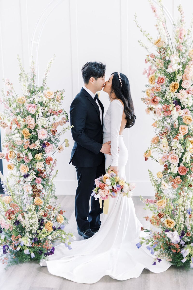
These aren't rules, just the combinations we're happiest to see on a timeline, held lightly. First: ivory, butter, and sage. It bounces warm, clean light onto every skin tone, the greens sit naturally beside the landscape's own greens, and the whole gallery reads like it belongs to the place it was made. If a couple asks us for one palette with no further questions, this is it.
Dusty blue, slate, and cream. Blue with grey in it is the most forgiving cool color we photograph: it flatters essentially everyone, casts almost nothing onto skin, and holds its character in mountain shade, where pure pastels can go thin. It's also the palette least changed by our bright, open exposure; what you chose is what you get.
Terracotta, rust, and bone, for fall and for the red rock. This is the palette that agrees with the light instead of arguing with it: golden hour warms it, canyon country reflects into it, and the earth tones keep faces warm without pushing them orange. In October, or in southern Utah any month, it's the strongest answer we know.
Black, white, and deep green, the black-tie palette. Black suits and gowns hold beautiful detail when the exposure is bright and open, optical whites stay crisp when the couple's own whites are chosen to match (more on that below), and deep green keeps the frame from going sterile. It's also the palette most likely to look exactly this good in thirty years, because it has already looked this good for sixty.
And soft lavender with grey. Lavender is the rare pastel that behaves like a neutral on camera: it casts almost nothing, photographs a touch cooler and quieter than the swatch, and sits beautifully next to grey suiting. For spring and early summer in the mountains, it's the gentlest palette we shoot.
The ones that fight the camera (and what we do if you love them)
First, the honest preamble: we photograph your wedding, not our preferences. Every color below has been worn at weddings we loved, and each comes with a real workaround. We'd just rather you choose with the camera's vote counted.
Neon and fluorescent anything at close range. These are the strongest casters we encounter; a fluorescent pink or chartreuse at arm's length paints the skin beside it, and that cast sits exactly where editing has the least room to work. The workaround is distance and dosage: keep the neon in details, florals, signage, and tablescapes rather than on the bodies standing next to faces all day, and put a neutral buffer (ivory, grey, tan) between the loud color and the skin.
Ultra-saturated jewel satin under harsh sun. Satin is shiny, and shine under alpine noon means hot specular highlights that blow out to white streaks while the surrounding fabric goes electric. The same colors in a matte fabric (crepe, chiffon) photograph a full step calmer. If the satin is non-negotiable, the schedule is the fix: we move the portraits that matter into shade and golden hour, where satin photographs the way the boutique mirror promised.
Pure optical white next to an ivory dress. Most wedding dresses are ivory or off-white; most bright-white shirts, bridesmaid dresses, and linens are optical white, treated to read blue-white. Side by side, the camera makes the mismatch obvious: the dress suddenly looks cream, or the shirts look blue, depending on which one we anchor. The workaround is a decision, either direction: match the whites to the dress's family, or separate them so deliberately that the contrast reads as intent.
All-dark palettes in dim reception light. Black on black on burgundy in a candlelit room gives the camera almost nothing to separate; bodies merge and detail drowns. We light those receptions deliberately (good flash work is a craft, and we treat it as one), and the photographs come out warm and dramatic, but know that the dark-palette evening will be a flash-lit story, not an ambient one. If you want moody and dark, give us one light-toned element (the dress, the cake, the linens) to hold the frame open.
We photograph your wedding, not our preferences. But the camera gets a vote.
What dates a gallery: the ten-year test
Here's a test we apply to everything we shoot and edit: will this still feel current at the tenth anniversary, when the gallery comes back out for the kids? Some of what dates a wedding gallery is the palette. Trend-cycle colors arrive loudly, peak for two or three seasons, and then become a timestamp; you can date a wedding photograph to its half-decade by the bridesmaid color alone. Naturals, muted mid-tones, and black-tie don't carry that timestamp, which is most of why we keep recommending them.
But more of what dates a gallery is the edit, and this is where we'll show you our convictions plainly. We don't put an orange filter on a frame and call it sun, and we don't pour teal into the shadows and call it cinema. Both looks are recognizable to the year they were fashionable, and both achieve their effect by bending the two things a photograph can least afford to bend. Skin is the first: when an edit warms or fades the whole frame, faces drift from how the people actually look, and the photograph starts feeling like a product instead of a memory. Greens are the second tell: pull the greens toward olive or grey, the way trend edits do, and every lawn and tree in Utah turns artificial. Keep skin real and greens natural and a photograph has almost nowhere left to date from.
So our standing advice on color, palette and edit alike, is the same sentence: choose and process for the wall, not the feed. A bright, true, softly contrasted photograph of a muted palette is the most durable image we know how to make. It looks right the week it's delivered, and the bet we're making, openly, is that it still looks right when the people in it have grey hair.
Keep skin real and greens natural, and a photograph has almost nowhere left to date from.
Asked and answered.
What wedding colors look best in photos? +
Muted mid-tones photograph best: ivory with butter and sage, dusty blue with slate and cream, terracotta with rust and bone, soft lavender with grey, and classic black-tie black and white with deep green. They work because the camera cares about reflected light, and gently desaturated colors bounce clean, flattering light onto skin instead of casting their own hue onto faces.
What colors should bridesmaids avoid for photos? +
Avoid neon and fluorescent shades, which throw a visible color cast onto skin at close range, and ultra-saturated jewel tones in shiny satin, which go electric and blow out highlights in direct sun. Pure optical white is also risky next to an ivory wedding dress, because the two whites visibly mismatch on camera. If you love a saturated color, choose it one step desaturated: sage instead of emerald, slate instead of royal blue, mauve instead of magenta.
Do wedding colors really matter for photography? +
Less than Pinterest implies, and more in one specific way: faces. An experienced photographer can make any palette work, but a strongly saturated palette reflects its color onto the skin of everyone wearing it, and that cast is the one thing editing can't fully remove without making skin look wrong. Choose colors that flatter skin in reflected light and everything else about the palette becomes a matter of taste, not physics.
Other planning guides.
The questions to ask before you book a wedding photographer.
A short guide for couples comparing photographers. Twelve questions, plus what to listen for in each answer.
How to build a wedding-day timeline that actually photographs.
A practical guide to building a wedding-day timeline that works for the family, the venue, and the light. Sample timelines included.
What wedding photography costs in Utah, and why.
An honest look at the Utah market: what the price tiers actually buy, what drives the number, and where to be careful at the cheap end.
How many hours of wedding photography do you actually need?
Four, six, or eight hours, mapped honestly to the most common Utah wedding-day shapes, including when fewer hours is genuinely enough.
The first look: what it changes, and how to decide.
First look or aisle reveal. What each choice does to your timeline, your light, and your portraits, with no dogma either way.
Utah wedding light, season by season.
How the light actually behaves here: canyon shade that ends early, brutal summer noon, long fall bench light, and winter receptions that run on flash.
Six months out: the wedding checklist that actually matters.
What to actually have done six months before your wedding, from the vendor who watches what happens when it wasn't. Three non-negotiables, the photo-critical decisions, and what to stop worrying about.
How photography works at an LDS temple wedding.
What is and isn't photographed on a temple wedding day, how the exit and the grounds become the heart of the coverage, and how to plan a day that includes everyone you love.
What a Utah wedding actually costs in 2026.
The median, the mean, and the category-by-category ranges we actually see in our market, including the Utah-specific factors no national cost guide accounts for.
How to have a beautiful Utah wedding on any budget.
Three fully worked Utah budgets (roughly $14,000, $24,000, and $45,000), the allocation percentages behind them, and the five mistakes that quietly cost couples the most.
Do you need a wedding videographer? An honest answer from the photo side.
We don't sell video, so we have no stake in your answer. What film gives you that photographs can't, what it costs in Utah, and when we'd honestly tell you to skip it.